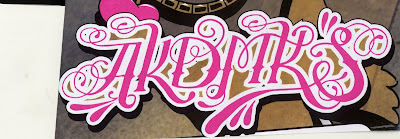
 i found this...thing...in a magazine last semester called misbehave or something. it was full of funky type usage and what not..but then i came across this and it just put me in a bad mood. first of all, what the heck does it say?!!?!? i have been trying to figure it out for a very long time and still havent come across a conclusion. it is beyond illegible. there is just too much going on and no real distinctions of each letter. i can totally see where they were going with this..but i think it needs to be either pink as the emphasis or curly letters or a funky type...not all in one. i dont really remember what was on the rest of the page, but im pretty sure this was the most distracting element. ok, i cant look at this anymore..im getting too annoyed.
Monday, February 18, 2008
umm...what?!
 i found this...thing...in a magazine last semester called misbehave or something. it was full of funky type usage and what not..but then i came across this and it just put me in a bad mood. first of all, what the heck does it say?!!?!? i have been trying to figure it out for a very long time and still havent come across a conclusion. it is beyond illegible. there is just too much going on and no real distinctions of each letter. i can totally see where they were going with this..but i think it needs to be either pink as the emphasis or curly letters or a funky type...not all in one. i dont really remember what was on the rest of the page, but im pretty sure this was the most distracting element. ok, i cant look at this anymore..im getting too annoyed.
Subscribe to:
Post Comments (Atom)
8 comments:
That logo is whack. You're right, there is way too much going on in this with the swirls, pink and elaborate font. Don't they know to keep it simple.
By the way is says AKDMKS. Which is an abbreviation for the urban clothing company Akademiks.
This is horrible!! It makes my eyes hurt! You would think that you'd want your brand name...or its abbreviation at least...to be legible to its prospective customers. Whoever said this was good, and let it go to print, needs to rethink some things. Maybe actually look at it first before giving it the "Ok."
Yah I saw this in a magazine too. I agree its impossible to read and way to decorative. It seems like it has so many swirls that are unneeded. I know I dont know this brand but it seems like if they are trying to brand stuff and get there name known that they would have a readable name.
Perhaps this is in a different language? Even if it is, it's still quite illegible. I love adding fun embellishments to my own type, but this designer obviously took it too far. The pink color seems to be okay because it goes along with this seemingly girlish typeface, but legibility is still a major concern here! If you can't read the name of the product, why on earth would a consumer want to buy it?
It is almost blinding when I first look at it. I kept having to take a double take when i read it. They really did need to keep it simple and classic. The designer must have just gone crazy and kept adding layers on top of layers until finally he stopped, but that was too late!!
I hate when there is so much fancy stuff that it makes it illegible. It draws attention for the wrong reason! Simple is better then this! Instead of knowing what this about i remember it for how annoying it is.
well i'm glad 'georgia' knows what is going on. After deciphering the letters AKDMKS, I still didn't know what it said. I needed some vowels. First, just because you can doesn't mean you should. this is way over the top and taking things too far. just because they have the ability to add all these swirls does not mean they should. second, I don't think a lot of people are very familiar with this brand so they especially need to make it legible and not abbreviate.
What in the world?! A sign is suppose to be simple and easily read. It's suppose to appeal to a driver, not make the wreck because they are trying to read what in the heck it says! There is way to much going on, the decorative designs, with the bright pink... not a smart decision, someone should have told the designer that sometimes less is more!
Post a Comment