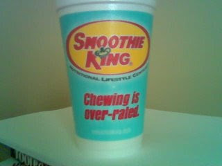
Ok so I don't know exactly why but I hate the Smoothie King logo. i don't like the color combination. It makes me think of all of the fast food restaurants like Wendy's and McDonald's, and I mean do you really want to be compared to those when you are trying to sell a healthy smoothie? I think not. Also I don't get why smoothie is slightly slanted and king is not. I just think that's weird because it doesn't look intentional it looks to me almost like they messed up or did something wrong. I don't know i could just be my eyes playing trick son me. And Lastly, I know that they have king in their name but really and crown on the "I," could they be any less original. They sell smoothies, there are plenty of fruits or other symbols that they could have incorporated into their logo besides a crown. Or if they really want to use the crown then at least put it in a more unique place with in the logo.
5 comments:
This color just gives me a headache to be honest. It doesn't really represent "healthy" lifestyle or anything. I can't stand their typeface either. It's very unoriginal... they just could have pushed harder to come out with something more creative. They should take lessons from Jamba juice or central market to go for a more "fresh" approach.
I actually almost posted this as my example. So obviously I agree that it is a really bad logo. It does not convey health or fruit or smoothies at all. It just represents a king. Which yes that is there name, but I feel like it would have been a more successful approach to do something that connects to their product.
I don't like it either. It's supposed to be a 'smooth'ie and the type is so harsh, nothing smooth about it. and the colors just continue to compete with one another. It's also very cluttered and not well organized. the spacing is so random and thrown together.
i hate this logo because its cheesy. sooooo cheesy. please be a little bit more obvious smoothie king. they color scheme alone doesnt represent royalty...they needed to go a little bit more research and try to apply some purples or golds in a classy manner because people who get smoothies are hip, they are with it, they are on top of things...they would appreciate a better, cleaner, more modern look.
The colors definitely look dated, they could use a nice re-designing, no? Also, the colors don't make me feel healthy. Seeing as they are a smoothie shop and they like to promote, "healthy living," shouldn't they appear to look cleaner and more fresh? Instead this looks thrown together and very clustered.
Post a Comment