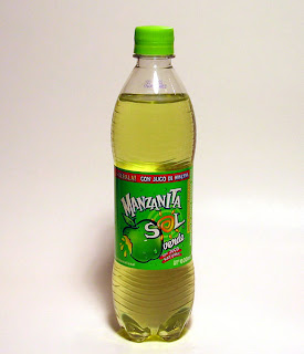
 Ok, so this drink label scared me when I first saw it. My roommates bought it from Albertson's, and I thought they were crazy. First off, I dont find this label attractive in any sense of the term. Secondly, I'm not sure what the designers of this label were going for. Yes this label is different than almost every other drink label, so maybe they wanted it to stand out, but I feel like this stands out in a bad way. The typeface used is like its trying to be a mix between a serif and san serif font. And while I am generally a fan of using image as type, I feel like it only becomes a distraction here. This label has a lot going on, only to be used to tell people that this is a drink. I personally enjoy drink labels/logos that are simple and to the point.
Monday, February 11, 2008
Little Apple Sun???
 Ok, so this drink label scared me when I first saw it. My roommates bought it from Albertson's, and I thought they were crazy. First off, I dont find this label attractive in any sense of the term. Secondly, I'm not sure what the designers of this label were going for. Yes this label is different than almost every other drink label, so maybe they wanted it to stand out, but I feel like this stands out in a bad way. The typeface used is like its trying to be a mix between a serif and san serif font. And while I am generally a fan of using image as type, I feel like it only becomes a distraction here. This label has a lot going on, only to be used to tell people that this is a drink. I personally enjoy drink labels/logos that are simple and to the point.
Subscribe to:
Post Comments (Atom)
6 comments:
I agree about this label; it demands my attention in a bad and annoying way!! There are too many distractions that equally compete for my attention: the typeface appears to be screaming at me because of its varying scale; the strange image of the sun stands out because of its bold orange color (which doesn't go well with the equally bad green color) and its spiral-like shape; the apple with the spitting juice (gross) has an unappealing black outline. Plus, the color of the bottle is too bright of a lime. I agree that a much simpler and calming label is needed here.
sick tell me you didn't let your roommate drink that? the design is really bad. I agree that it is distracting. It makes the drink look unappetizing verses delicious. They definitely need to simplify their design.
I would not drink this solely on the label design, it's that bad. It is so not inviting. I feel like the color of the berverage and then the label just repel off each other which translate a negative image back to the viewer and causes the viewer to have a negative feel about the drink. Also this appears to be a very natural drink and the design is so fabricated that it clashes and they don't support one another.
when i first saw this, i thought ew craig no. i see that bottle and i think just another nasty, weird apple drink. and it probably is. the whole label is just wrong. why is it mexican foods are always packaged in a slightly tacky manner? i know i would take the opportunity to simplify and use the spanish in a good way. it would stick out more compared to other packages. the big apple right by the sun is very distracting and too much is going on. one or the other, they dont need both images. i think if they got rid of the container all together it would work more.
i too agree with the dislike of the label. i was way over done and crazy. it attracts to much attention in a negative way. i would not drink this syrupy mess just because of the feeling i get when i look at the packaging. they need to take a lot out and simplify the overall design. less is more.
The overall green palette conveys a natural drink that it is sour. I think the logo and type make this drink feel cheap and therefore lowers the legitimacy of the company and the product they sell.
Post a Comment