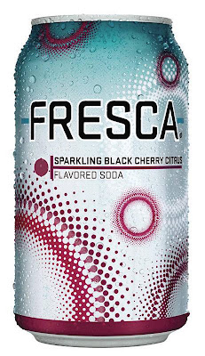
I love the taste of Fresca it is my soft drink of choice. So when i was looking for a beverage container i turned to my favorite and never really noticed that it is actually one of my favorite can designs. I like the use of colors i think they work well together and i also really like the circle design it makes a good contrast to the vertical cylindrical shape of the can. i also like the range of sizes that they use for their circle design and the that it is in negative form in the background. I think the font contrasts well with the designs.
6 comments:
Fresca did a nice job redesigning their identity; it's much cleaner, simpler and more subtle than their old look, which was too bold and had too much fruit imagery! I like the typeface because it's unusual but clean, and the color combination of the teal and maroon is appealing. The pattern is quite different too, and I like how it mimics the circular droplets of condensation that form on the can when it's still cold. Refreshing, like it should be!
I have to agree that I do enjoy the design on the fresca can. It is modern and fresh and looks like a "cool" drink that all the kids are drinking these days. I appreciate how even though there is a sort of complex design, the type is still very dominant and legible.
It's fun, spunky, and fresh looking. haivng had fresco before I do think that the can design supports whats inside, although i don't know if a new costomer would be as prone to pick up this can. It's a little risky and they may be unsure of what exactly they are getting. but for those loyal customers I feel the design may make more sense. I also like the uniqueness of the 'fresca' typeface.
i loveee fresca. its delicious and when you need some carbonation, it hits the spot. i remember when drinking fresca was lame and no one ever bought it, but their new look really did a good job at making their name and product stick out. i love the fun design and compared to other canned beverages it is the most fun. the color scheme is light and the design of the can has lots of movement that just catches your eye on the shelf. well done fresca.
i agree that fresca did a great job with this design. it is simple with no over the top illustrations. they used a nice san serif font though out the design and a nice use of rules. the rules have a nice contrast with the different size circles. the colors are also very sophisticated.
It's so funny, this can is actually has a sense of a kind of layout design. You know? Like something you would use on a powerpoint or something. The modern circles give it feeling that it's "hip" while at the same time showing that it's a bubbly drink. It makes me think that on the inside everything is fizzy and kind of having a party.
Post a Comment