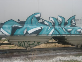
 I've always admired graffiti artists. While many times it defaces property, I've always seen some form of beauty in it. It takes a great deal of talent to do what they do. Looking at this one, I see the cool gradation, and the depth created with just spray paint. I can't really read what it says, but to me that doesn't matter. I just enjoy seeing the talent they have.
Tuesday, February 26, 2008
Get it Big!
 I've always admired graffiti artists. While many times it defaces property, I've always seen some form of beauty in it. It takes a great deal of talent to do what they do. Looking at this one, I see the cool gradation, and the depth created with just spray paint. I can't really read what it says, but to me that doesn't matter. I just enjoy seeing the talent they have.
Subscribe to:
Post Comments (Atom)
9 comments:
The letters in this piece are so distorted that they are totally illegible to me. I do like the 3-D aspect that was done with the shadows under the letters and the highlights. The letters also look like they are going into the background which is a cool effect that I haven't really seen to this extent before in graffiti.
I don't really believe that graffiti art has anything to do with legibility, unless the artist is trying to convey something to their audience. But most of the time it looks like they are just expressing themselves through their work. In this case I believe it was just a form of self-expression. I do enjoy the way the artist manipulated letterforms to almost look like a landscape, and the gradations are very well done.
This piece contrasts to the one bellow it, which is also on a train. This piece is more illegible than the one posted bellow. And like pollypocket said, graffiti does not necessarily have to do with legibility. So both cases are successful in their own right.
This is really well done especially because the bottom of the type is incomplete which leaves a lot to the imagination. I too agree that graffiti has anything to do with legibility. I think the audience should interpret the art themselves.. which makes this type of expression special. The colors blue and grey are a nice alternative to.. say black for instance. The blue would stand out way more than black would on a grey background.
I like the color in this one. It give a water feeling that goes along with it coming up from the bottom. Then with it's free forms it really creates this movement like water rocking around.
This is very illegible, however i really think the colors turned out well. Graffiti is usually illegible so it doesnt bother me its like a different language that i dont understand.
this example doesnt really look like letters, it looks more like a waves to me...flowing, splashing water..but thats the thing about graffiti, its what you make of it basically. i love the color scheme and the use of circles. the circles create an organic and stable element to the overall look.
I would agree that the legibility is definitely not there, but I don't think that's the purpose. But if that's not the purpose what is it? Because more graffiti artist don't use turquoise to express themselves, so to see it in this color makes me wonder what the purpose is exactly. I do love the color and gradation of this work, it really is a piece of art without even trying.
I agree that graffiti can be beautiful, and I think this is a good example. I appreciate the curvy and angular strokes of each letter, and I actually think the gradient makes the letters jump out you (instead of going back into space). The black background and fun, varied circular shapes also add depth. It's almost as if I am looking at this graffiti with 3-D glasses!
Post a Comment