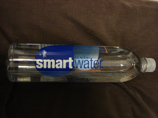
 I think the simplicity and minimalism of this design matches the product of water perfectly. You don't want to buy water (something so pure and clean) and have crazy/complex designs on its bottle! Even though it is simple, I really enjoy the hidden design elements that you have to look closely to see, like the goldfish saying,"spring water is for swimming, smartwater is for drinking." Also, I enjoy how they fit the nutrition facts and bar code into the design, rather than having it randomly placed on the opposing side of the logo. It fits perfectly under one of the blue water-droplet forms, under the "smart" in "smartwater." Also, the copy that explains what smartwater is all about is very witty and gets straight to the point; it also fits well into the design by wrapping around one of the bule water-droplet forms.
Monday, February 11, 2008
Smart design! Smartwater!
 I think the simplicity and minimalism of this design matches the product of water perfectly. You don't want to buy water (something so pure and clean) and have crazy/complex designs on its bottle! Even though it is simple, I really enjoy the hidden design elements that you have to look closely to see, like the goldfish saying,"spring water is for swimming, smartwater is for drinking." Also, I enjoy how they fit the nutrition facts and bar code into the design, rather than having it randomly placed on the opposing side of the logo. It fits perfectly under one of the blue water-droplet forms, under the "smart" in "smartwater." Also, the copy that explains what smartwater is all about is very witty and gets straight to the point; it also fits well into the design by wrapping around one of the bule water-droplet forms.
Subscribe to:
Post Comments (Atom)
7 comments:
I love smart water, and mostly because of its packaging and design. Their logo is just so pleasing and not distracting. I also really enjoy the contrast between smart and water.
oh smart water, how clever you are. I was not familiar with this brand until I came to college, so what a rushed familiarity I got with it, because everyone has one in their hand. It's a great design in that it intacts with the water. It's not over powering, but rather plays with and in the water. the idea of keeping it very see through while having desing to enjoy through the bottle is genious. this helps support the idea of this super fresh water.
i love smart water but i used to not buy it much because the bottle used to be HUGE and they finally got smart and made them in a normal person size. i would say i probably would only choose to drink water because of its package design. it tastes the same of everything else but the modern, clean quality of the table and the design makes it stand out. they refused to put pictures of water coming down a mountain or what not. all the little elements of the design sort of entertain you while drinking the water..i know i can just stare at the bottle for like hours and explain to myself what i like about the label.(i hope thats not weird)one thing i really like about the type choice and the contrast they use with it.
I have personally drank this water and I dont think its made me any smarter... so I think its false lable. But it is designed pretty well because it is so simple and clean like you want your water to be.
Smart Water... is amazing! That's pretty much all I have to say. The contrast in the type fits perfectly for what it is. It speaks clarity and very minimal. Also, the overall packaging design is fabulous. The use of type on the inside of the sticker, to show the beauty and purity of the water. So as oppose to just looking on the outside of the product, the packaging design forces you to also see their product... GENIUS! :)
I love smart water. Mainly due to the little fish on the inside that you can only see if you look through the bottle. I think that their packaging is so clean that it catches your eye and goes with the idea of water, pure, clean and simple.
I love smart water for its design and the water!! i think it is so clever how they designed the outside and the inside, it is just fun to look at. Smart water also stands out for their different bottles and classic design, i really like how the type isnt set horizontally it is very unique!
Post a Comment