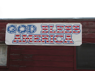
This is the outdoor sign for a store that appears a little too patriotic. Yes, I am a proud American, but this sign doesn't appeal to me at all. It is entirely too illegible due to their incorporation of the American flag in a bold type along with a thick blue outline that surrounds each letter, which is spaced way too far from the interior form. This makes the sign almost impossible to read from far away!! Plus, the letters having no spaces between each other, making the words even more illegible. The designers of this sign still could have gotten the patriotic style across without going overboard on the flag idea; perhaps a little contrast would have worked, such as a combination of all-cap, bold Century Schoolbook type (like what they have) for "America" and a nice script for "God Bless"? A little red, white and blue could be used too, but just the phrase "God Bless America" itself is patriotic enough to get the message across.
6 comments:
I really enjoy your post! Not only do you give criticism, but you also give advice on how to fix their design! I agree with you in that a simpler, more clean design would have worked better for this store's logo, and that in calling their store "God Bless America" you already know they are patriotic. Their main problem is legibility, which could be fixed by uniting the image of the flag and the typography of "God Bless America" together. The worst part about it for me, is how icequeen said the outline of the letter and the image don't match up.
I agree this is way to much. The should of just had text and a flag outside if they wanted the flag image so bad. I agree with the other comments and that its hard to read not legible and needs to be slimplifyed because it has so much going on.
I agree that they went overboard with this sign. I understand the need or want to be patriotic but that's a little bit too much. I think that your advice on how to fix it would work much better than what they have now. They need to choose one aspect of the flag, or the colors, or something and focus on that. Not throw them all together.
I agree, it is not appealing at all. It actually does the opposite and makes me what to go away from it. With all three words filled in with parts of the flag, it is a bit much. A much simpler approach would have been to just fill in one word like. And yes, the outline and image not matching up is really distracting and just a sloppy inexcusable job.
ew. really? In order to be patriotic does that mean you have to include the WHOLE flag? come on designer. It is super illegible, I agree with the previous post, they should have separated the type and the image, and it would have proved to be a much better design, with just a simple change.
Post a Comment