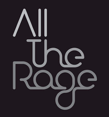
This is the logo design for events management company
All The Rage LTD. This bugs me a lot because type choice doesn't convey all the rage at all. It looks like a neon sign which if anything is neutral and doesn't convey rage at all typographically. I understand that in a business you probably don't want to have a very angry type face because it isn't very pleasing, but in this case I don't think that neon sign type is "all the rage" it could have been maybe in the late 80's early 90's but not now. I also do not like all of the ligatures which furthers this neon sign feel to the logo
6 comments:
I disagree with you. I think that the typeface convey's the hip "scene" and the type that goes along with it. The dance clubs and bars that you might expect to find a line outside of all use similar fonts on flyers and sometimes signage outside their clubs.
I don't know how I feel about this sign. It definitely does not convey "all the rage" to me. It looks much more sleek and chic than hip and popular. The ligatures are well done because when you first read it, you do not even notice them, but after further observation you begin to see that there is a multitude of them. I think they should have chosen a different slogan if they wanted to stick with their simplistic typeography.
I agree that it doesnt appear RAGE and mad. I like the use of the type and flow with the liqitures if it had a different message. I really like the effect on the A not having a crossbar.
I actually find this to be an interesting choice in typeface, although if I didn't know what "All the Rage" was, I wouldn't be able to tell from the company's logo. However, the typeface indicates that the company has intentions of being "hip" and fashionable in whatever they do. I like the way the type flows from one letter to the next.
I kind of disagree with you too. I think the type conveys the message "all the rage," however, I think it needs to be in a different color. Color is everything in a logo.. it pushes a brand even further. I like how the ligatures are intentional.. they personally work for me.
I like this kind of type. It's a little risky and I understand where you're coming from in that it doesn't seem like it's raging. But it's really unique and reminds me of Paul Rands work.
Post a Comment