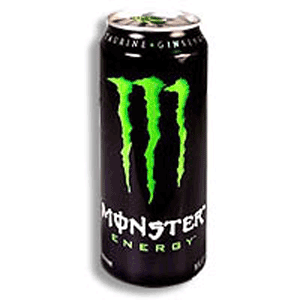
 I personally do not like the taste of Monster energy drink, so I have never paid much attention to the label or typography. But once I did, I thought that it was really clever how they designed the M in such a way to make it look like a monster had clawed the initial into the can. Also, the choice of color is very appropriate in this situation. Usually such a bright lime green on a black background would be tacky, but because of the monster theme it works. I also appreciate how they wrapped the text around the can.
Monday, February 11, 2008
Monster!
 I personally do not like the taste of Monster energy drink, so I have never paid much attention to the label or typography. But once I did, I thought that it was really clever how they designed the M in such a way to make it look like a monster had clawed the initial into the can. Also, the choice of color is very appropriate in this situation. Usually such a bright lime green on a black background would be tacky, but because of the monster theme it works. I also appreciate how they wrapped the text around the can.
Subscribe to:
Post Comments (Atom)
6 comments:
I also do not like the taste of this energy, actually i don't really like the taste of any energy drinks. I agree that their design is done quite well. I enjoy how simple it is, in that there are no graphics and a single letterform dominating the can. I believe that they are even more clever for using type as image, to make the M. I enjoy the detailing of the M to look riggity and rough because it creates and nice contrast between the other words, which are mostly done in san serif typefaces.
I think this edgy approach works for this drink. with energy drinks I sometimes feel like they can do almost anything because of the contents inside. But this one is actually pretty good having what looks like the claw of a "monster" ripping through the can as if the drink iside is the monster trying to get out. and at the same time the mark makes and 'm.' clever, and it works.
The claw marks representing an "M" really work for this product. The Packaging is so simple that the large lime green "M" contrasts nicely with the other type and they don't overpower or fight for your attention. You see the claw marks, read Monster and then get that the claw marks look like an "M'.
i think this design is clever. it is a nice play on words and i agree that green and black normally wouldnt be a good solution but it works pretty well for this!
I agree that their design is well done. The simple use of a claw on the can gets the point across that its a monster and yet it's still very legible to tell that it's an M. The only thing that really bothers me is in the name "Monster" I'm not quite sure why they decided to use the "o" with a line down the middle. While yes it looks cool, and kind of like whichery, but does it serve a purpose?
I appreciate how the M represents the first letter in the name monster as well looks as if a monster did it himself through the way the type rips into the can. The strong verticality of the M also helps accentuate the over all large size of the can which can aid the consumer in their opinion of the value of the drink.
Post a Comment