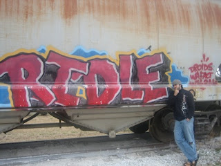
this was a interesting type graffiti , it was interesting to see that from close it really just looked like a normal graffiti but when you stood away there was like a motion to it , the letter seem like they are wabbling , or shaking . there is this liquid aspect to the font also just because of the colours in the back aswell and the several layers on the piece. there is an interesting light on the side, like a light shadow.
5 comments:
this one is so funny because it says "ridle" which is obviously spelled wrong. So I guess the riddle was is where's the missing "d?" and it is cool to see that from further away you get something different from it.
I wonder if they really did spell it wrong, or if they just didnt know how to spell riddle. If they did it on purpose that is really creative. The motion in the piece is really interesting as well, I appreciate that it is just static.
I think that the bumpy edges of the letters is a different style than is typically seen with graffiti. I also wondered where the other "d" in riddle was but I guess that was what the artist was going for. Also, the white highlight lines help to give the text some dimension.
I really like the effect used on the type it really give it movement. I think it might of purposly been miss spelled. I get a feeling that most graffiti has like a sercet meaning and stands for other things.
What I like the most about this graffiti are the layers of color. The blue seems to recede the furthest, followed by the yellow, black, red and white. This layered effect makes the actual letters jump out at you! The jagged outlines of the letters as well as the uneven placement of the letters also give the graffiti movement-I think it looks like the letters are vibrating!
Post a Comment