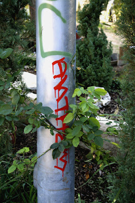
 i took this photograph in austin last semester in a dirt bike park. it was really ransom how i can across the area, but it was pretty sweet. i really don't know what it says but it is visually pleasing. i think its funny that this graffiti is surrounded by plants and in a very natury spot. even though there is not a whole lot to the tag, i think it is beautiful.
Monday, February 25, 2008
Austinite
 i took this photograph in austin last semester in a dirt bike park. it was really ransom how i can across the area, but it was pretty sweet. i really don't know what it says but it is visually pleasing. i think its funny that this graffiti is surrounded by plants and in a very natury spot. even though there is not a whole lot to the tag, i think it is beautiful.
Subscribe to:
Post Comments (Atom)
9 comments:
I think that putting graffiti on a pole and vertical really adds a new effect to it. You typically see ti on the sides of wall or trains. Using the pole surrounded by plants gives the piece a new meaning and I like that you can see drop marks from the paint, i think that it makes the whole piece more interesting.
I agree with georgia, the part that I really admire is how the paint drips down off of each letter, and since the letters are horizontal to the poll the drips come across the letterforms horizontally. Normally when people do the paint dripping effect in any work of art with type, the drips come down vertically. It's very unusual in interesting.
I agree with the yall I like the use of the vertical pole. I also like the dripping effect, it seems as if the type is bleeding. I wonder if that plays into what it is saying or if the paint just ran.
Wow, this would be really random to come across on your everyday walk. I like the way the paint is dripping as well. This adds for a pretty interesting effect... like normally people would be like "oh man it's dripping.. its messed up." But because this is done on purpose it looks neat.
I'm not positive what it is about this one, but I love it. I think it's that rich red against the shiny silver. also with the text cascading down the poll it gives this appearance of the words just moving down the poll. Then there's this affect of the urban metal and graffiti against the beautiful rich greens of nature. very vibrant and even passionate I would say.
i think this is cool because it is something i have never seen before. Those graffiti artists dont consider anything off limits do they? Well i think its cool and the color is eye catching however it is very illegible to me.
i like the vertical position of this example. you dont really see that much. the drips add an interesting effect and the color really makes it stand out. it sort of looks like blood.
It actually is a really nice tag. The way they put it vertically instead of horizontally is really unique and visually appealing. I agree that the dripping effects really add to the piece as a whole. I bet the artist didn't even want that to happen, but it is a nice effect; kinda like blood... hm.
I agree with Meredith; I think the most visually appealing aspect of this graffiti is the paint that drips from the ends of each stroke. These marks accent the verticality of the pole and the letters, which some of you also liked. It's also interesting that the green leaves form an x on top of the lettering, which shows the stark contrast between the urban, red, dark letters in the graffiti and the natural greenery surrounding the pole. Hmmm, this would be a great picture for an ad campaign about keeping the city clean and beautiful!
Post a Comment