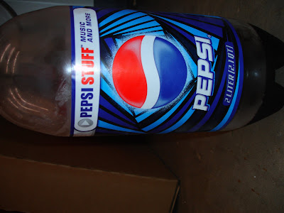
 first of all, sorry this picture is horizontal, the computer was being stupid. to begin, i hate pepsi. i think its gross and the packaging for it has always annoyed me and has discouraged me to ever give pepsi a chance. coke is better in taste and packaging. the type face used for Pepsi is trying too hard to be modern, or even futuristic. It has a harsh feeling that doesn't make much contrast with the bottle itself. the label is so vivid and busy that the name pepsi just blends in with it. maybe thats a good thing? a way to trick people into drinking pepsi? the blue shadow doesn't help much either. they really need to simplify and adjust their color scheme to make their product name more visually appealing and stand out on the shelves. coke has a classic design, its simple and recognizable, but i feel like whenever i see a pepsi can they are always trying all these new looks and none of them flow and go with each other. they are all random and unsuccessful.
Monday, February 11, 2008
coke is much better than pepsi
 first of all, sorry this picture is horizontal, the computer was being stupid. to begin, i hate pepsi. i think its gross and the packaging for it has always annoyed me and has discouraged me to ever give pepsi a chance. coke is better in taste and packaging. the type face used for Pepsi is trying too hard to be modern, or even futuristic. It has a harsh feeling that doesn't make much contrast with the bottle itself. the label is so vivid and busy that the name pepsi just blends in with it. maybe thats a good thing? a way to trick people into drinking pepsi? the blue shadow doesn't help much either. they really need to simplify and adjust their color scheme to make their product name more visually appealing and stand out on the shelves. coke has a classic design, its simple and recognizable, but i feel like whenever i see a pepsi can they are always trying all these new looks and none of them flow and go with each other. they are all random and unsuccessful.
Subscribe to:
Post Comments (Atom)
3 comments:
I agree. I Hate Pepsi. They are always changing their packaging because they can't seem to find a classic one like Coke has. Maybe they think that they can't do something like that because Coke's is simple. But all of the illusions and patterns in the background of their packaging make me hate pepsi even more. And PS I would totally know the difference between Coke and Pepsi if I were given the Pepsi challenge. And I would obviously choose Coke.
i agree.... coke is much better than pepsi. and i too agree that this logo is not one of my favorites. i dont really like the font of the "PEPSI" and i dont think it works with what the product really is. the logo is to hard for something that is supposed to be smooth. but i do think the logo above the type (the circle) works. it has a nice flow to it.
I agree that Pepsi needs to hire a good designer as oppose to changing their design all the time. I've always wondered why they use the half blue and red circle. I understand the wave part, to try to show flow, but red, white, and blue? Really? Please get a little more cliche. What do the colors red, white, and blue really say about their product? 'Yep, we're not that creative, we're trying to appeal to everyone' Come on, be adventurous, then maybe you can get a better design.
Post a Comment