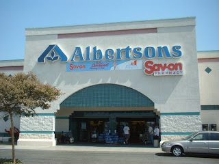
 I have never been a big fan of the Albertsons logo, but then when we go this assignment, I took another look at the logo and I definitely do not like it and it bothers me. The letters are kind of square, but then parts of them will randomly be curvy and have a little tail at the end. The big A with the three leaves in it is awkwardly placed. They should have explored just using that for the A in Albertsons instead of having both. It gets kind of redundant. Also, I feel like there are spacing problems. First the AL are really close to each other, then the l and b are a little more spread apart and the l and e are even more spread apart. Then there is a big gap between the e and next l and then they throw in a ligature and it starts all over again!
Monday, February 18, 2008
 I have never been a big fan of the Albertsons logo, but then when we go this assignment, I took another look at the logo and I definitely do not like it and it bothers me. The letters are kind of square, but then parts of them will randomly be curvy and have a little tail at the end. The big A with the three leaves in it is awkwardly placed. They should have explored just using that for the A in Albertsons instead of having both. It gets kind of redundant. Also, I feel like there are spacing problems. First the AL are really close to each other, then the l and b are a little more spread apart and the l and e are even more spread apart. Then there is a big gap between the e and next l and then they throw in a ligature and it starts all over again!
Subscribe to:
Post Comments (Atom)
No comments:
Post a Comment