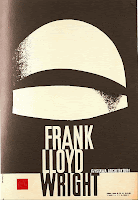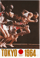

I chose these two posters because they are both from the 60's era... and they both use a variation of the "Impact" typeface. I wanted to show how popular this typeface has become to illustrate a message to the public. Impact is still widely used today. I thought the color usage in the Olympic poster really represents the time period... and it goes well with the typeface. The second poster uses just black and white which matches the simplicity and boldness of the typeface. Using Impact basically makes the posters speak for themselves. There is just not that much else going on as far as clipart goes... which is a good thing. Like I said the type speaks for itself.
5 comments:
I would like to see something that paid tribute to the use of Impact in the 60's as opposed to something that is actually from the 60's. Howeve, I agree impact is used to make bold statements, because it is so dense, so the two posters are good uses of the type.
I agree that these posters are very good examples of making statements, and the typeface impact is a very wise choice when you want to get your point across. These posters are good examples where the typography speaks almost louder than the picture does.
i appreciate how you definetly get the 60's poster look to it , kinda of like how they enphasized mostly on the picture and it was much more of a visual aspect that was preciated that an emphasis on the type.
what i feel is great about the typeface 'impact' is how it self describes itself with it's own name. It is usually used when wanting to be direct because when used with too much text it can become unreadable. So you have to be direct to leave your 'impact.' like in these posers. using impact and being direct. you can feel the 60s era within these pieces.
I think using the more old-fashioned style catches your attention about the issue more then a modern would. They are both great examples of type used to catch your attention and speak loudly.
Post a Comment