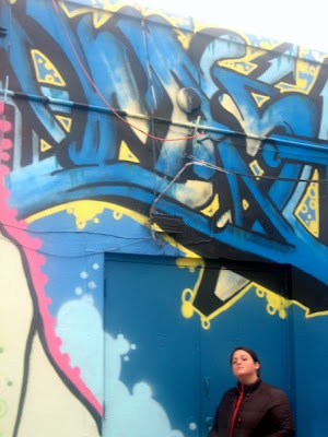
I have no idea what this says, but i love it. You know sometimes I think we just have to break out and be inspired. I love graffiti because I feel it's not there to please anybody else but the atist who makes it (for the most part), and as graphic designers most of, if not all of what we do is picked apart and all about making somebody else happy. We have clients that we have to please. So for me graffiti is so freeing. This doesn't makes sense in legibility or readability, but I feel like I get it, or I'm at least able to take it the way I want. It's free and it's fun and it represents the culture that many of us don't fully understand. In this particular piece I love the extreme movement and passionate colors. Whoever is the artist was fully committed to this piece and there was no turing back. I love the passion in that. and from that I feel it's what you make of it.
3 comments:
I love all of the overlapping letterforms as well as the colors used. It all works so nicely together and keeps the eye moving around the piece trying to absorb all of the different things that are incorporated. And I wonder how they got the graffiti up so high. Were they standing on a car?
It looks like whoever did this piece was extremely dedicated to detail with the protruding letters and the mixing of the colors. It's interesting though because there is no specific hierarchy, which would almost be a bad thing in design, but in this case... it's okay because it keeps the eyes circulating through and the audience tries to determine the meaning of the piece.
haha i like how you are in this bethany! i really like the overlapping type as well and the colors. The attention to detail is great, and very interesting.
Post a Comment