Tuesday, February 26, 2008
Get it Big!
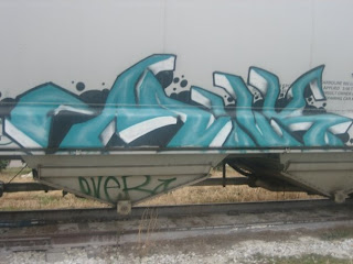 I've always admired graffiti artists. While many times it defaces property, I've always seen some form of beauty in it. It takes a great deal of talent to do what they do. Looking at this one, I see the cool gradation, and the depth created with just spray paint. I can't really read what it says, but to me that doesn't matter. I just enjoy seeing the talent they have.
fo sho
 Wow, so this is actually one of the graffiti's that I could actually read. Most graffiti that I've seen on the street and what not, I've always thought to myself, "What in the heck does that say, and what does it mean?!" But this one is actually a legible one. Graffiti definitely shows art in a different way, in represents the culture and the lifestyle. In this one, the use of positive and negative really stood out to me. That even a very low art, uses commonly used elements of high art. It even slightly reminds me of our self-portrait assignments because it takes the first word ("kill") and puts it in a unique position. Instead of just putting on top of the word, or right above it, the artist puts it in the word making it one unite. Even though the message isn't very nice, it definitely shows the culture while also showing a fun piece of artwork.
in the hood.
 how sketchy does this photo look? the elements of graffiti that fascinates me is the the most is the meaning and why they chose certain locations to draw on. graffiti, as a whole, is not very legible. yet, all graffiti type looks the same? but they are all different? it confuses me. i think the bubble letters is what makes graffiti what it is. they really use line as an important element to make their logo or what not. though this is a pretty plain example, i think its a good basis of the well known look of graffiti.
Monday, February 25, 2008
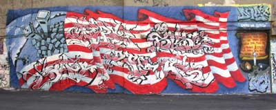 This is from when i went to New York, and it is funny because i remembered taking it and now that i went back and looked at it again i noticed so many more things about it. It like the way they integrated the type into the American flag, although it is illegible it is more tastefully done then alot of other graffiti. It really show that American spirit and that a tragedy can inspire and affect everyone including those who like to create graffiti, i think it is beautiful and well done.
Deep Ellum
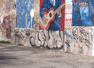
So I decided to go to Deep Ellum where they supposedly have great examples of urban art. Far from the truth... most of it was actually painted over. I thought it was pretty sad to tell you the truth. I thought this example was the most interesting because of mural behind the type. It was bright and colorful, the urban art itself was more subdued--which compliments the mural. Not really sure what exactly the the urban art says... it actually looks incomplete. I think the way the letters are darker underneath gives nice depth to the walls. The type bounced off the wall as I approached it. In case you guys don't know the specifics of Deep Ellum.. here are some facts from the Dallas Convention and Visitors Bureau: Deep Ellum is an entertainment and arts district on Elm Street east of downtown Dallas in Dallas County. The area was settled as a "freedmens' town" by former slaves after the Civil War; its location on Elm Street, just east of the Houston and Texas Central tracks near the depot, was too far from downtown Dallas to be desirable. The area was called Deep Elm or, as early residents pronounced it, "Deep Ellum". Because of the proximity of the railroad, it was also called Central Track. But anyways.. this place was known at one time to have an enormous amount of urban art... it was the people's way of expressing themselves when they didn't have a lot of money.

I found this graffiti on the side of a train car. I thought that the font was really cool looking the way the letters fit together and how the tail o the "R" extends out farther than usual. Also, The colors go so well together because they are complementary. But how they outlined every letter in the lighter green gives it a really interesting layered effect. I also like the red around the letters and how it turns into bubbles. Overall, really cool looking and I wish that I could do that with a can of spray paint.
Austinite
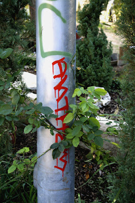 i took this photograph in austin last semester in a dirt bike park. it was really ransom how i can across the area, but it was pretty sweet. i really don't know what it says but it is visually pleasing. i think its funny that this graffiti is surrounded by plants and in a very natury spot. even though there is not a whole lot to the tag, i think it is beautiful.
Blackletter's comeback...in Mexican graffiti!

Even though this typeface called Blackletter was associated with Nazi propaganda, it's making a comeback in all types of markets in order to bring an "edgy vibe" to the type. Here it's used in Mexican graffiti, which is interesting considering the fact that I used Juicy Couture as an earlier example with Blackletter as its choice of typeface. In this case, I think this typeface shows the diversity and vivacity of Mexican culture. I tend to find that Mexican culture uses lots of bright colors too in their art, so this artistic design obviously captures the heart of the culture. It's also interesting that such a typeface can act differently in certain contexts...this meaning of expressing Mexican culture is entirely different from Nazi and Juicy Couture's meanings..
Sunday, February 24, 2008
 I found this example of graffiti on a street right off of Vickery. Even though I have no idea what it means, I find it ironic that the street is called Smiley and the first word that is written on the left is "Frown." That's the only sense I could make of it after observing the design and its surroundings. Driving around Vickery I saw a few more places where "Mit" is written his logo (with its signature bubble font and the distinct shape the M makes with its bottom strokes all coming together at a point). It makes me wonder who Mit is and why he uses that as his graffiti code name.
London Graffiti
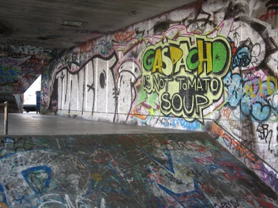 Here is graffiti from London that I had from 2 years ago when I went. I like how anywhere you are can be a canvas and how you can put a message anywhere. There is alot of graffiti seen here but the main focus is put on Gaspacho is not tomato soup. Im not sure if this has some secret gang meaning but it is very well made. I like the all caps used on GASPACHO and how the letter forms overlap. I also like the technique used for shadding behind the letter forms it creates a unique shape.
Friday, February 22, 2008
 This is a great example of graffiti done well. The f is executed so well unlike most graffiti which may look cool, but it just done quit and sloppily. I also really like how they incorporated the pole into the graffiti instead of just painting around it. The colors work really well with each other as well. I think that it is interesting that they took the time to put a serif on the end of the F. I also really like the layered look that this piece holds. The graffiti artist took a letter form, and through the process of spray paint made something that looks like it could be high art. I really appreciate all the detail that was put into this and think people might think differently about graffiti if it all shared such detail.
Thursday, February 21, 2008
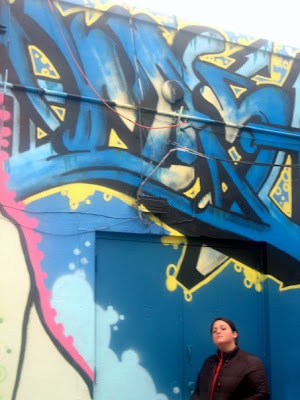
I have no idea what this says, but i love it. You know sometimes I think we just have to break out and be inspired. I love graffiti because I feel it's not there to please anybody else but the atist who makes it (for the most part), and as graphic designers most of, if not all of what we do is picked apart and all about making somebody else happy. We have clients that we have to please. So for me graffiti is so freeing. This doesn't makes sense in legibility or readability, but I feel like I get it, or I'm at least able to take it the way I want. It's free and it's fun and it represents the culture that many of us don't fully understand. In this particular piece I love the extreme movement and passionate colors. Whoever is the artist was fully committed to this piece and there was no turing back. I love the passion in that. and from that I feel it's what you make of it.
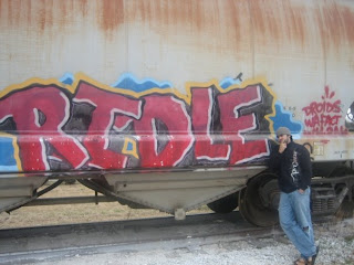
this was a interesting type graffiti , it was interesting to see that from close it really just looked like a normal graffiti but when you stood away there was like a motion to it , the letter seem like they are wabbling , or shaking . there is this liquid aspect to the font also just because of the colours in the back aswell and the several layers on the piece. there is an interesting light on the side, like a light shadow.
Tuesday, February 19, 2008
NECK FACE is a great name for a metal band
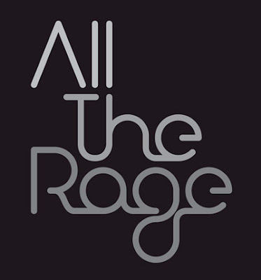 This is the logo design for events management company All The Rage LTD. This bugs me a lot because type choice doesn't convey all the rage at all. It looks like a neon sign which if anything is neutral and doesn't convey rage at all typographically. I understand that in a business you probably don't want to have a very angry type face because it isn't very pleasing, but in this case I don't think that neon sign type is "all the rage" it could have been maybe in the late 80's early 90's but not now. I also do not like all of the ligatures which furthers this neon sign feel to the logo
great book , crappy type

this is one of my favorite books,and one i had to stare at for so long because it was part of my training . i really dont appreciate the colors and the way the type was displayed on the cover of the book. there is a highligh on the word master plan but the gfotn just looks tacky and doesnt go along with the other types in the boo. the letters of name of the author seem deformed or stretched and their positioning really disturbs me....the whole cover seems confusing to me. i would love to see this simplified , so the message comes out better.
I though Starbucks had good design...
 Okay so every time I see this at Starbucks I can't STAND it! Seriously. It's relating a serious message, in an amateur, almost kidish font. Most public signs are in a sans serif, usually helvetica, and very structured, so no one can read into the message rather just read the message as it is. But this sign doesn't get the point across at all! Instead I read the message and think to myself, okay so Starbucks is a smoke-free place but it's actually a cool thingto do. It's sad that through a font you can read that much into a sign, but it's true. And it makes me a little upset because Starbucks has such great designs when it comes to their products, but when it comes to their consumers health, they could almost care less, but rather throw together a sign that shows that they are "hip".
annoying
 I have hated the verizon logo for a while now. I think there is too much going on, they always say that are making progress but what does the z and the weird check mark have to do with that. I also think the colors are not fitting they are kind of do intense i think. I just feel like the design could have been pushed farther then just adding a check mark and making the z extend and fade out.
Monday, February 18, 2008
Not actually the king.
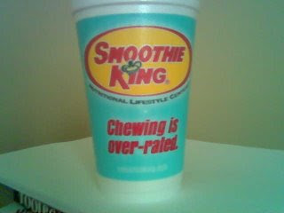
Ok so I don't know exactly why but I hate the Smoothie King logo. i don't like the color combination. It makes me think of all of the fast food restaurants like Wendy's and McDonald's, and I mean do you really want to be compared to those when you are trying to sell a healthy smoothie? I think not. Also I don't get why smoothie is slightly slanted and king is not. I just think that's weird because it doesn't look intentional it looks to me almost like they messed up or did something wrong. I don't know i could just be my eyes playing trick son me. And Lastly, I know that they have king in their name but really and crown on the "I," could they be any less original. They sell smoothies, there are plenty of fruits or other symbols that they could have incorporated into their logo besides a crown. Or if they really want to use the crown then at least put it in a more unique place with in the logo.
Everytime I sit on the toilet
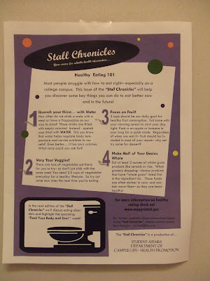 I live at the Delta Gamma sorority house in Worth Hills here at TCU. Everytime you go to the bathroom you see this little mini news letter put on my campus life. Everytime I see it I cringe. The thing that drives me the most crazy would have to be the unnessisary drop shadows put behind the numbers. Next thing that drives me crazy is the fact there is like 40 different fonts used... lets make this a little bit more simple. Also 4 different shapes are used making it feel cluttered. I dont know who does this for TCU but they should be fired.
back to shcool..... back to shcool
 The person who carefully painted this road marking should have perhaps spent a bit more time brushing up on their spelling, rather than perfecting their brush strokes. Someone who is going to make a sign for a school should maybe go back to it for a few spelling lessons. A pet peeve of mine is spelling.... first of all i am the WORST speller ever! but if i were to do something like this, i would have double checked to see what i was doing. well at least it has the word "cool" in it.... which i am.
Too illegible means too patriotic!
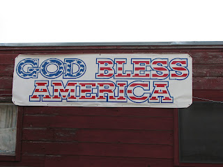
This is the outdoor sign for a store that appears a little too patriotic. Yes, I am a proud American, but this sign doesn't appeal to me at all. It is entirely too illegible due to their incorporation of the American flag in a bold type along with a thick blue outline that surrounds each letter, which is spaced way too far from the interior form. This makes the sign almost impossible to read from far away!! Plus, the letters having no spaces between each other, making the words even more illegible. The designers of this sign still could have gotten the patriotic style across without going overboard on the flag idea; perhaps a little contrast would have worked, such as a combination of all-cap, bold Century Schoolbook type (like what they have) for "America" and a nice script for "God Bless"? A little red, white and blue could be used too, but just the phrase "God Bless America" itself is patriotic enough to get the message across.
Mexican't You Spell?
umm...what?!
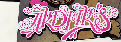 i found this...thing...in a magazine last semester called misbehave or something. it was full of funky type usage and what not..but then i came across this and it just put me in a bad mood. first of all, what the heck does it say?!!?!? i have been trying to figure it out for a very long time and still havent come across a conclusion. it is beyond illegible. there is just too much going on and no real distinctions of each letter. i can totally see where they were going with this..but i think it needs to be either pink as the emphasis or curly letters or a funky type...not all in one. i dont really remember what was on the rest of the page, but im pretty sure this was the most distracting element. ok, i cant look at this anymore..im getting too annoyed.
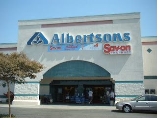 I have never been a big fan of the Albertsons logo, but then when we go this assignment, I took another look at the logo and I definitely do not like it and it bothers me. The letters are kind of square, but then parts of them will randomly be curvy and have a little tail at the end. The big A with the three leaves in it is awkwardly placed. They should have explored just using that for the A in Albertsons instead of having both. It gets kind of redundant. Also, I feel like there are spacing problems. First the AL are really close to each other, then the l and b are a little more spread apart and the l and e are even more spread apart. Then there is a big gap between the e and next l and then they throw in a ligature and it starts all over again!
Gold Medal for Worst Design

I know we talked about this design at the beginning of the semester, but since then I have seen it a lot more, which I think is a complete shame. This is definitely a pieces that has us all saying "WHAT WERE THEY THINKING?!" Right off the bat, it's illegible. The viewere is left wondering what exactly is going on, and not in a good way. There are some designs that may be a little off to try and spark the viewers curiousity and invite them to look longer to see the clever solution. This has no clever solution. As a viewer you are dissapointed after sticking around and trying to figure it out because it doesn't work and only leaves you scratching your head. I understand trying to make it more modern and flashy to get your attention, but they can't tell us this was the only way to go about it. some very simple solutions would be to: at least make the two "2's" match (since they don't match we wonder if they are bother "2s"), either don't make the zero so jagged so we know it's a zero and the olympic symbol is the cut out or actually make a hole in the zero (we need somthing to link it to the normal form of a zero), and make the one straight because since everything is mis-shapen right now it could be intrerpretted at a one or a seven. Obvioulsy it needs more help than that, but those suggestions would be a start.
how can I "have a nice day" when you are ugly
 I hate getting caught at this light on university and having to stare at this billboard. It has bothered me since our type 1 days, when we were learning how letterforms were created. If Farrington Field wants to cut their letters out of sticky tape stuff, they need to make sure they put all of the counters of the letterforms in the correct places so they do not alter the width of the letter's stroke. The counters of the O's and R's on the top line are terribly placed!!! If no one fixes this, I think I'm going to get out of my car one day with a ladder and fix them myself!
Thursday, February 14, 2008
Tuesday, February 12, 2008
i'm naked
 i know i'm late. real late.... but i did it! so....I really enjoy this juice because it's all natural... hence the name of "Naked." the font of the logo is a very soft san serif, which is very basic like the drink. the "antioxidant" font is in a stamp like font with had lots of texture.... again like the drink. the color also relate to the product and by duplicating the drink color. i appreciate the simplicity of the design and layout of the label. it is playful and gets the point across of what the drink actually is and whats in it.
Frostie Fun

I couldn't resist posting this bottle made by "Frostie". I found it at Central Market, where you can find some of the most interesting packaging designs done by obscure but wonderful companies. I really appreciate the typeface of the word "Frostie"; the angled baseline, bubble-like letters with snow resting on top them and funny image of an eskimo (perhaps?) add to the product's uniqueness and fun character. It is weird to see the word in combination with "cherry limeade", which contrastingly is made up of more tropical colors and square letters. However, I still find the bottle quite cute, and that's the reason why it caught my eye in the store.

I thought that this bottle was really cool because of the use of the monkey which is actually a little bit 3D and wraps around the bottle s well as the name of the drink being raised. They are both in gold which draws your eye to them. In addition to the monkey, the name being in a curvy font adds a sense of fun to the bottle.
mmm water!
 Dasani does a great job not only with design but also typography. The S softly resembles the ripples of water, as do the As. While these are very simple elements they do an effective job using the letters in the brand. The design is also very well planned out because it takes the color of blue, which resembles water, but also is a little transparent so you can see the purity of their water.
Monday, February 11, 2008
Little Apple Sun???
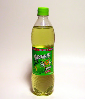 Ok, so this drink label scared me when I first saw it. My roommates bought it from Albertson's, and I thought they were crazy. First off, I dont find this label attractive in any sense of the term. Secondly, I'm not sure what the designers of this label were going for. Yes this label is different than almost every other drink label, so maybe they wanted it to stand out, but I feel like this stands out in a bad way. The typeface used is like its trying to be a mix between a serif and san serif font. And while I am generally a fan of using image as type, I feel like it only becomes a distraction here. This label has a lot going on, only to be used to tell people that this is a drink. I personally enjoy drink labels/logos that are simple and to the point.
A little more than Lemon and Lime

When trying to think of what beverage to use I wasn't sure, but it came down to the one I know the best. I probably have a sprite about once a day. Not on purpose, it just happens that way. So, on to the logo and type. This one is interesting in that it was redone within the past two years or earlier. About that time there were a lot of companies that were revamping their logos (like doritos, sunchips, pepsi, etc.) and sprite, a coca-cola brand, did the same. It's a much more modern look. But what I like about it is it's crisp, clean, fresh look which I feel represents the product well. Not too complicated and kind of simple but still enjoyable. The logo represents the 'lemon-lime' part of the drink and the 'sprite' type is crisp and clean. I really like the freshness and simplicity of it all. The first time I saw it after is was updated I wasn't too sure, but it's definitely grown on me.
Monster!
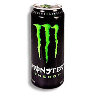 I personally do not like the taste of Monster energy drink, so I have never paid much attention to the label or typography. But once I did, I thought that it was really clever how they designed the M in such a way to make it look like a monster had clawed the initial into the can. Also, the choice of color is very appropriate in this situation. Usually such a bright lime green on a black background would be tacky, but because of the monster theme it works. I also appreciate how they wrapped the text around the can.
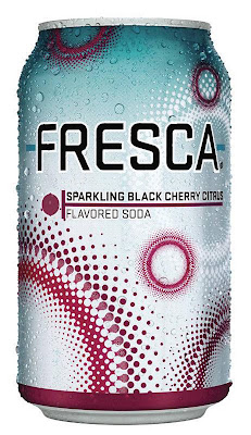
I love the taste of Fresca it is my soft drink of choice. So when i was looking for a beverage container i turned to my favorite and never really noticed that it is actually one of my favorite can designs. I like the use of colors i think they work well together and i also really like the circle design it makes a good contrast to the vertical cylindrical shape of the can. i also like the range of sizes that they use for their circle design and the that it is in negative form in the background. I think the font contrasts well with the designs.
coke is much better than pepsi
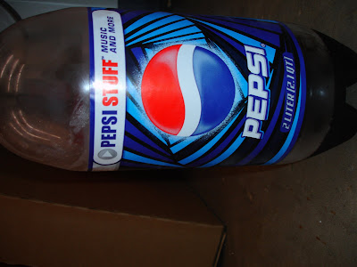 first of all, sorry this picture is horizontal, the computer was being stupid. to begin, i hate pepsi. i think its gross and the packaging for it has always annoyed me and has discouraged me to ever give pepsi a chance. coke is better in taste and packaging. the type face used for Pepsi is trying too hard to be modern, or even futuristic. It has a harsh feeling that doesn't make much contrast with the bottle itself. the label is so vivid and busy that the name pepsi just blends in with it. maybe thats a good thing? a way to trick people into drinking pepsi? the blue shadow doesn't help much either. they really need to simplify and adjust their color scheme to make their product name more visually appealing and stand out on the shelves. coke has a classic design, its simple and recognizable, but i feel like whenever i see a pepsi can they are always trying all these new looks and none of them flow and go with each other. they are all random and unsuccessful.
Imported drinks = imported design

i chose the arizona tea bottle just because i believe it is one of great design. they did a great job in making the bottle have a very oriental look. the ornamnets on the bottle almost give a hand crafted look to it and the colours and lines are as if they were individually painted on the bottle. the letter contain gold again going to the theme of asia and richness. the design is more thematic and really works well, it gives this idea of tea and asiatic culture . the design really separates from the other teas on the shelf , it almost imposes itself as a higher quality drink just by the look and design.
Smart design! Smartwater!
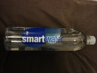 I think the simplicity and minimalism of this design matches the product of water perfectly. You don't want to buy water (something so pure and clean) and have crazy/complex designs on its bottle! Even though it is simple, I really enjoy the hidden design elements that you have to look closely to see, like the goldfish saying,"spring water is for swimming, smartwater is for drinking." Also, I enjoy how they fit the nutrition facts and bar code into the design, rather than having it randomly placed on the opposing side of the logo. It fits perfectly under one of the blue water-droplet forms, under the "smart" in "smartwater." Also, the copy that explains what smartwater is all about is very witty and gets straight to the point; it also fits well into the design by wrapping around one of the bule water-droplet forms.
Here's a little bubbly: Pink Champagne


I used this beverage container because it stood out to me way before I even bought the bottle at a local store. I saw this at one of my friend's house and immediately I was drawn to the "pinkness" of it. The label is very simple with just pink text, but somehow that makes a statement itself. When I bought this, I actually thought it was a rose champagne... which I've been told not to drink too much of. But it actually is a sparkling blend of Pinot Noir and Chardonnay from South Eastern Australia. It displays strawberry aromas and refreshing fruit flavors of sweet berry & lime (according to their website). I like the handwritten effect on the name "Pink" as well as the smaller type for the name of the company. It's nice that this company did a sans serif variation for the small text... other wise it would have been too much with the entire label composed in a handwritten font. I also like the fact that they carried over the pink color to the back of the bottle.. this really carries out the brand. Although, I do kind of think that the bar code in pink is a little overbearing. One thing that I would have liked to see this company try is to use a nice white paper label rather than a clear one.. just an idea.
Starbucks' Classy Look


Many coffee companies have tried to capture the same classic, stylish look of Starbucks' logo, but it's hard to emulate and surpass one such an identity. You can always tell a Starbucks cup from far away because of their simple white cups with the black and green logo with plain white text. The actual san-serif typeface isn't that interesting, but it's simple and recognizable to everyone. I also love their cups for their "The Way I See It" campaign on the back of the cups. It's a clever idea to have a number of different quotes from "stylish" and popular people around the world, and I actually look forward to seeing which quote I get every time I order a drink. It's interesting they chose a serif typeface for the text, but it still keeps to the Starbucks style. I'm also a big fan of their red cups they come out with during Christmas time; the design (which includes both the illustrations and the text on the cups) has a sense of delight that mimics the holiday season cheer and makes me full of exuberance!
Saturday, February 9, 2008
Capri Sun
 I like the subsitution used in this Capri Sun container. The palm tree used as an I pulls in a topical feel relating to the flavor of capri sun. I think I would like the other type better if a different treatment had been done to Capri Sun the use of all caps and an outline make it appear more cheesy.
Tuesday, February 5, 2008
Krispy Kreme throwback
 I've always enjoyed the Krispy Kreme logo because of its throwback look to the 50's, and the fact that it makes my mouth water every time I see it! The logo type because of its red color, and the long serifs, mixed with the dots surrounding it, pays homage to the 50's. Its such a well done logo. Also, the dot of the eye integrated into the artsy serif of the K creates a doughnut shape. Very simple, yet effective.
Monday, February 4, 2008
 I found this in the January 21, 2008 issue of Sports Illustrated. I really enjoyed how they made the advertisement look like a letter from an old-school typewriter. The background looks worn and a little dirty, and some of the words are smudged and faded, which help make the letter look more realistic. Also, this typewriter style makes the ad more personal. Even though it isn't handwritten, it seems more intimate than an email or a typed letter from the computer. The way they used the typewriter feel works well in this ad.
IMPACT type makes an impact in the '60s
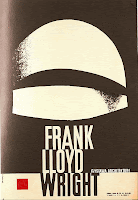
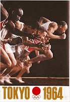
I chose these two posters because they are both from the 60's era... and they both use a variation of the "Impact" typeface. I wanted to show how popular this typeface has become to illustrate a message to the public. Impact is still widely used today. I thought the color usage in the Olympic poster really represents the time period... and it goes well with the typeface. The second poster uses just black and white which matches the simplicity and boldness of the typeface. Using Impact basically makes the posters speak for themselves. There is just not that much else going on as far as clipart goes... which is a good thing. Like I said the type speaks for itself.
 The style is very retro. The colors and the extension of the cross bars as well as the ligature are very fun and funky. I do not think the logo and style are true to the store, it is a department store with traditional things such as polo. The style kind of reminds me of the old diners, it is very clean and i like the san serif font it is pretty unique, i haven't really seen anything else like it around and i appreciate the retro feel and reference.
"Birt of Venus"
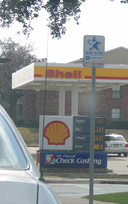 I chose the 'Shell' gas station as it seemed to refer to the early painting of the "Birth of Venus." While it doesn't refer to type as much, there is still a visual representation of the image through the present day type. Keeping it simple the idea is subtle and not as obvious to those that aren't aware of art history. However, I believe there is a subconscious that feels a familiarity with Shell and by having that familiarity, the audience would be more prone to use it. In the original painting and style of the time, the type represents the simple and clear idea.
