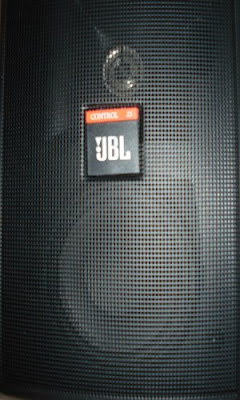
 i would never look to a speaker for type so that is why i picked this for unexpected type. this logo is very simple and clever. there is a exclamation mark with in the composition right above the J. i think it is random that there is type right in the middle of the meshed speaker. the red band at the top catches your attention which makes you look at it harder.
Tuesday, March 4, 2008
yo yo yo......speakers!!
 i would never look to a speaker for type so that is why i picked this for unexpected type. this logo is very simple and clever. there is a exclamation mark with in the composition right above the J. i think it is random that there is type right in the middle of the meshed speaker. the red band at the top catches your attention which makes you look at it harder.
Subscribe to:
Post Comments (Atom)
4 comments:
I really like their logo with the integration of the exclamation point! At first, I didn't know what it was, but once I looked closer and read your comment I saw it! I think that is a very smart advertising move. By putting type in the center of the speaker it creates a lot of blank space around it, which draws the eye to it!
the exclamation point seems like it should be more purposeful. I don't quite understand the placement of it. I do think JBL does a good job with product identification though. Clean and placed in multiple places all over the speaker, to make sure people would be able to see what brand it was, not just a speaker, it's JBL
Good point! JBL definitely makes an obvious effort to advertise themselves on their product. I think that the exclamation point is a great touch. It says LOUD! which is what you would expect from a speaker system.
I think this logo works pretty well, and while there's a big part of me that wants the exclamation point on the right side because of everything we learned in school and of course the english teacher for a mom that I have. but with that said I think they were purposeful in putting it in that spot because they were making the logo compact just like the speaker. And I still read it as an eclamation like it's coming out of a booming speaker.
Post a Comment