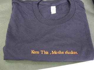
 This was a t shirt being auctioned off at creative summit. Everyone who passed by this shirt started laughing. The kerning is actually done really poorly. I also think it was a good decision to leave it small and simple. Leaving it two colors was a good decision and leaves the focus on the phrase. My favorite part is the comma because it obviously kerned way far to the right.
Tuesday, April 8, 2008
 This was a t shirt being auctioned off at creative summit. Everyone who passed by this shirt started laughing. The kerning is actually done really poorly. I also think it was a good decision to leave it small and simple. Leaving it two colors was a good decision and leaves the focus on the phrase. My favorite part is the comma because it obviously kerned way far to the right.
Subscribe to:
Post Comments (Atom)
2 comments:
I'm sure wearing this t-shirt would cause lots of attention, even though most people have no idea what kerning is! However, even if someone didn't know, they could get a good idea of what it is just by looking at the shirt. The analogous color combination really makes the words stand out. Despite the use of abrasive language, it's not as bad to read because of the way it's terribly kerned!
Post a Comment