 Even though this uses a stencil type, (which I find not to be the most intriguing type due to over use in Army, etc.) This Guerilla Marketing is very effective. It is a good example of to keep your eyes open because you don't know where your great new idea will come from.
Tuesday, April 8, 2008
Guerilla Marketing
Even though this uses a stencil type, (which I find not to be the most intriguing type due to over use in Army, etc.) This Guerilla Marketing is very effective. It is a good example of to keep your eyes open because you don't know where your great new idea will come from.
John Deere on the Move

I saw this ad a few years ago and really liked the typography usage on the side of it. I just thought it was very inventive use of typography for a construction equipment company. It definitely adds a flair to this ad--fading from left to right. The only thing I don't like about this ad is the busy background. I wouldn't have noticed it at first, but it makes it a bit tough to read the copy. It also takes away from the funky type on the side.
 This was a t shirt being auctioned off at creative summit. Everyone who passed by this shirt started laughing. The kerning is actually done really poorly. I also think it was a good decision to leave it small and simple. Leaving it two colors was a good decision and leaves the focus on the phrase. My favorite part is the comma because it obviously kerned way far to the right.
colour and layers

this was a really fun piece that had alot of layers and it was really interesting because alot of it was done with reall light tones so it all blends in. their type is really interesting because some of the bodies are filled in and some are not . the VS has to layers which makes really intrgate how it is played and how it adds to the ground of the piece. the type combines well, the messy with the clean.
The Traveling pants needs a new designer...
 I won't lie, i love these books. But since before i was even a graphic design major this cover has driven me CRAZY! The type reminds me a lot of crulz which i usually dont like at all. i know that it is supposed to be fun and aimed at teenagers but that doesnt mean you have to use a font like this. I think they colors and type are just overkill of trying to make this book look young and hip. I do not like the way the layout is, i dont think they type and the imagery work well together they seem to be different units. I think they could have pushed this farther and made it look young and "fresh" rather than this.
Monday, April 7, 2008
doormat speaks for itself

This doormat is so cool. As you walk up to the doorstep, it tells you to "come in" and as you leave the doorstep it tells you to "go away." This design shows us how the possibilities with typography are endless. By manipulating letters to look a certain way, the designer was able to make the words legible both right-side-up and upside down. Clever and beautiful intriguing!
As You Wish

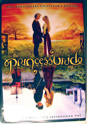
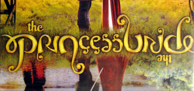 So my roommate got this movie and brought it home the other day and I was so intrigued by the type on the title. I thought that is was a really unique idea to have the dvd cover be able to be flipped upside down. But what really got me is that the type of the title can be flipped as well. It reads the same both ways without having to be repeated. I kept staring at the dvd cover for about 10 minutes trying to figure out if that was really happening and looking at all of the letters to see how they made them able to be read both ways. I think that having the type only used once in the middle and allowing it to be able to be flipped along with the cover help to tie this dvd cover together and make it a really interesting piece to look at.


can you please pass the napkins?
 my parents are on the parents council which is apparently a big deal and they are very excited about it. they had a thing this weekend with a some big shindig in a tent by the main...there was booze and lobster. woohoo. anyways, they decided to give me a napkin. for some reason. they said "you are the reason we are on the council, here we got this for you". in the back of my mind, id like to think they are catching onto the idea of what a graphic designer looks for in daily life...or at least i like to tell myself that. instead of thinking of the idea that my parents gave me a napkin for a present. ANYWAYS!! i was admiring the napkin, because lets face it, i love type. i thought TCU did a very good job at laying out this logo for the new campaign they have going on. (TCU needs more money...in a nutshell) the contrast of the script type with the san serif of "the" and "for" is beautiful in my opinion. and i really love that TCU kept their logo within the campaign logo. it really gives the napkin a warmth and, frankly, i want to support the campaign. the simplicity throughout the whole look is very comforting and pleasing to the eye.
Just try and be illegible, I dare you
I think this video is probably the most impressive use of type in a music video I've ever seen. It's nearly perfectly executed, so that even words backwards and upside-down are even legible. For other fun type videos watch these:
The Hush Sound- The Lion's Roar
What is Typography
Pulp Fiction, in Type
Enjoy
Hand crafted

For this wild card I wanted to show a student's piece from DSVC. I'm displaying this one not so much because it was my favorite piece or because it has some amazing layout, but because it was ALL done by hand. This piece is about 2'x 3' to give you some kind of idea of the size. It was really cool to look close and see all of the detail. To put this all together while not having the option of earasing just enhances the effort of pre-planning and bringing it all together. It was also interesting to get up close and actually read the tiny, tiny words and the illustrations are also very intricate. For me this piece was more of a representation of what is possible and what we are capable of doing.
Sunday, April 6, 2008
The Beautiful Side of Type!
 I happened to be browsing some type blogs, and I came across one called "The Ministry of Type" that featured these designs using numbers. Even though the numbers aren't actually made of the elements of nature, I find the unified solution quite breathtaking; I could have never pictured type as such beautiful forms! I love the way the designer combined both the numbers and images; he or she did so in a way to look as if the flowers, leaves, vines, etc. are growing out of the numbers. I like some of the curvy, organic lines found in the numbers, such as the horizontal stroke of the seven and the vertical, left stroke of the four. The combination of thick and thin lines of the numbers also imitate the randomness that's found in nature. There is a definite contrast between the bold, black forms of the numbers and the thinner, more delicate, colored forms of the images, but the designer combined the two so well that the pictures look like a unit.
Wednesday, April 2, 2008
WILD CARD!
Seek and find an extraordinarily brilliant or extremely poor use of type. Your call -- make it count; it's the final blog of the semester!
Tuesday, April 1, 2008
K ernth is, Mo fo

This was the title page from an editorial spread. The spread was all about type and this gave an awesome visual representation of what goes on in during kerning. I thought it was a great/funny concept , and was executed very nicely to get the idea across.


I really enjoy how this body copy works with the image and subject of the story. I feel it complements the images and really helps back the subject. When I first saw it, I was immediately drawn into it, because of the diagonals in the body copy. I think it really attracts the reader and makes them interested in, and want to read, the story. They did a nice job of allowing the diagonals in the body copy to flow into the images. Also, even with the diagonals, the body is still legible, as is the interesting headline design.
Just some thoughts
 This is the cover page for the Adam Carolla spread in the LA Magazine. It is a very unique approach to displaying body type while also going along with the idea that the spread is "getting in his head". Even though it is kind of hard to read and follow because of the lack of hierarchy, it is a good solution given the problem. The designer was able to really capture the idea of being able to get into someone's head with the chaos and almost random thoughts.
A Visual Approach to Fashion

I found this magazine spread in Marie Claire and really liked the type treatment at the bottom (using paint for the dots of the "i"). I also thought it was interesting how they incorporated the paintings for the models' heads... a rather different approach to expressing fashion. I'm glad the designer decided to use a green color for the dots, and not white.. to match the rest of the type. The green gives it that extra punch. I also really like the fact that the designer used photographs to express this topic.. and not words... so the reader knows exactly what's in fashion... and that is painter styles/or artistic fabrics.
Knowledge is Power
 This layout was done by National Forest who is located in LA. I really enjoy this spread because of its simplicity. usually i really dont enjoy reading the text and just look at the pictures, but in this one i would be willing to read the type. the amount of type is balanced though out the layout, which help out the readability of the piece.
Atypement
 I really like the different sections of type they used in this. I also really like the rag on the left hand side it is something you dont see often and i think it works well for this layout. It looks classy and interesting by using the positive negative effect with the type and the different columns, and also helps to give there illusion that there isnt as much copy to read.
Type is never out of Fashion


First I want to apologize for the bad scanning job, I'm not sure what happenned but I think you can get the layout and the contrast in type that I wanted to show. I wanted to show these images together because I think they do a good job of demonstrating the way fashion magazines use type to create a very crisp and sophisticated look while pushing the boundries at the same time. It's a thin line to tread between this classy and clashy look. When I saw the Table of Contents in the top image I had a hard time with it. I immediately felt that I needed to hate it because of the over use of typefaces and this almost clashing going on between them, but I have to say that the more I look at it the more I love it. And I know a lot of you all probably won't but what I enjoy about it is this extreme contrast between the ultra thin sans serif and the bulkier serifed type. The serifed type has that standard look that we expect in the fashion magazines with the thick and thin strokes in the same type. But then when you look closer there is even a slight difference between the serifed letterforms. I guess what I love about it is that it is breaking the rules, but at the same time imitating them. I want to look longer and closer, and I like that. Then with the second image I wanted to show how many fashion magazines tend to layout their articles. I love the pulled quote as the "Hoffman said" screams for our attention into the quote that is there to then spark our interest in the actual article. What I love about it is that it pushes everything just a little bit. All in it's own fashion conscious way.
type vs pictures

this was an interesting design for a spread out , it seems though that the images are really overwhelming the space. the text is really compact but it works well at the same time. im kinda divided by how i feel i think it works rally well for this spread out bu tmostly cus all connects with the way they displayed their pictures . also a feature that connects the piece together is the headline type that has that cubical or geometrical quality of the shapes surrounding. the text is well placed and compact , good choice of size in my opnion and still legible. it would have been interesting to see if they could have had type instead of shapes. also really nice aproach of making it look upside down, it got me confused for a wile, its not very conventional.
Subscribe to:
Comments (Atom)