 Even though this uses a stencil type, (which I find not to be the most intriguing type due to over use in Army, etc.) This Guerilla Marketing is very effective. It is a good example of to keep your eyes open because you don't know where your great new idea will come from.
Tuesday, April 8, 2008
Guerilla Marketing
Even though this uses a stencil type, (which I find not to be the most intriguing type due to over use in Army, etc.) This Guerilla Marketing is very effective. It is a good example of to keep your eyes open because you don't know where your great new idea will come from.
John Deere on the Move

I saw this ad a few years ago and really liked the typography usage on the side of it. I just thought it was very inventive use of typography for a construction equipment company. It definitely adds a flair to this ad--fading from left to right. The only thing I don't like about this ad is the busy background. I wouldn't have noticed it at first, but it makes it a bit tough to read the copy. It also takes away from the funky type on the side.
 This was a t shirt being auctioned off at creative summit. Everyone who passed by this shirt started laughing. The kerning is actually done really poorly. I also think it was a good decision to leave it small and simple. Leaving it two colors was a good decision and leaves the focus on the phrase. My favorite part is the comma because it obviously kerned way far to the right.
colour and layers

this was a really fun piece that had alot of layers and it was really interesting because alot of it was done with reall light tones so it all blends in. their type is really interesting because some of the bodies are filled in and some are not . the VS has to layers which makes really intrgate how it is played and how it adds to the ground of the piece. the type combines well, the messy with the clean.
The Traveling pants needs a new designer...
 I won't lie, i love these books. But since before i was even a graphic design major this cover has driven me CRAZY! The type reminds me a lot of crulz which i usually dont like at all. i know that it is supposed to be fun and aimed at teenagers but that doesnt mean you have to use a font like this. I think they colors and type are just overkill of trying to make this book look young and hip. I do not like the way the layout is, i dont think they type and the imagery work well together they seem to be different units. I think they could have pushed this farther and made it look young and "fresh" rather than this.
Monday, April 7, 2008
doormat speaks for itself

This doormat is so cool. As you walk up to the doorstep, it tells you to "come in" and as you leave the doorstep it tells you to "go away." This design shows us how the possibilities with typography are endless. By manipulating letters to look a certain way, the designer was able to make the words legible both right-side-up and upside down. Clever and beautiful intriguing!
As You Wish

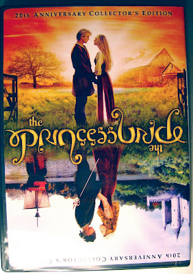
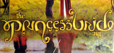 So my roommate got this movie and brought it home the other day and I was so intrigued by the type on the title. I thought that is was a really unique idea to have the dvd cover be able to be flipped upside down. But what really got me is that the type of the title can be flipped as well. It reads the same both ways without having to be repeated. I kept staring at the dvd cover for about 10 minutes trying to figure out if that was really happening and looking at all of the letters to see how they made them able to be read both ways. I think that having the type only used once in the middle and allowing it to be able to be flipped along with the cover help to tie this dvd cover together and make it a really interesting piece to look at.
Subscribe to:
Comments (Atom)